Filter
RSS

Blog

Cup and Handle Chart Pattern


It’s a bright sunny day. You are traveling from Bangalore to Pune by road. You have reached midway somewhere near Hubli when you stop for some rest and refreshment. What is the first thing that comes to your mind? Chai… That cup of tea freshens you up and you are ready to move north. Similar is the case in technical analysis. A cup and handle pattern is a chart pattern that takes the shape of a cup with a handle. It is a trend continuation chart pattern. The stock price is moving north. In between it takes a break, it forms a pattern that resembles a cup with a handle. After that break, the stock again starts heading towards north. The Cup with Handle formation was popularized by William J. O’Neil in his book “How to make money in stocks?”.

What is a Cup with Handle chart pattern?
As the name suggests a cup with a handle chart pattern is a pattern of price movement on the trading chart that looks similar to a cup with a handle. A “U” shaped price movement forms the cup section and a short price pullback from the edge of the cup forms the handle. The pattern shows the movement of the stock in the past and helps us predict the stock's movement in the future. However, this pattern takes time to form. The formation may be as short as seven weeks or as long as 65 weeks or more. A cup and handle pattern provides a logical entry point, a stop-loss level, and a profit target.

How to identify a cup and handle pattern?
The pattern can be formed in any timeframe. However, it is advisable to focus on the daily timeframe. Being a continuation pattern, there has to be a prior trend and the same needs to be understood first.
Identifying the bullish cup and handle pattern: - There must be an established uptrend for the bullish cup and handle pattern to form. However, the trend should not be a mature one as it would reduce its chances to continue. The cup is formed by a normal fall in prices that gradually reverses forming a “U” shape. It should have a bowl or rounding bottom and not a sharp “V” shaped bottom. A rounding bottom ensures that there is a consolidation with valid support at the bottom of the “U”. The pattern could have equal highs on both sides of the cup, but this is not a necessity. The depth of the cup is another lookout point. The cup should not be too deep.
The fall in security price that forms on the right side after the formation of the cup is the “handle”. It is a short pullback that slopes downward. This can be taken as a small consolidation before the big breakout. While the cup can extend from 7 to 65 weeks, the handle may take about 1 to 4 weeks to form. Let us try to understand this with the help of the following example -

A visible cup and handle pattern followed by a breakout can be seen in the above example of Kolte Patil Developers stock. The black line shows a small uptrend in the stock. The stock has reached Rs.277 from Rs.206. A normal fall in prices to Rs.132 and gradual reversal to Rs.277.3 breaking the previous high leads to the formation of the cup. There is a steady decline till the bottom and steady incline back to the previous high leading to a “U” shape cup and not a “V” shape cup. The security has created two highs near Rs.277 at the start and end of the cup, which is a typical characteristic of the cup. We can see that at the end of the cup, the security has faced a minor correction before giving a breakout at Rs.280. This minor correction is called “The Handle”. The breakout at Rs.280 is also giving a buy signal.
An important point needs to be noted. Volume data can be very helpful in both patterns. Volume should decrease during the formation of the pattern and there should be an increase when breakout/breakdown happens after the formation of the handle.
Store


What can be an ideal entry, price target, and stop-loss?
The price which breaks out of the upper trend line is an ideal entry price (Rs.466 in our example). Security can be purchased at the close of the breakout candlestick. There are two target prices for this pattern. The first target is an estimated distance equivalent to the depth of the handle. The second target is equivalent to the depth of the cup, starting from the point of breakout. If after buying at the breakout, the price drops, instead of rising, a stop-loss order is needed. The stop-loss should be at a level that is below the lowest point of the handle.

Limitations of the Cup and Handle Pattern.
Every coin has two sides. Similarly, the cup with handle pattern also has certain limitations. The main disadvantage is the time taken to form a clear pattern. A fully developed pattern may take one to six months to form or even more. This might delay the investment decisions. The depth of the cup is another issue. In some cases, a shallower cup can give a strong bull run and, in some cases, a deep cup can be a false signal. In certain exceptional circumstances, Cups forming without handles also limit the utility of this theory. Like other technical patterns, the cup and handle pattern can be unreliable in illiquid markets.

Bottomline
The cup and handle pattern when formed in a nicely rising bull market, tests an old high and encounters selling pressure because of profit booking. The price gradually declines and consolidates over time because the selling pressure is not high. New buyers and old buyers see the reduction as an opportunity to take a long position in the market, leading to a gradual increase and retesting the high from where the pullback initially started. The more the consolidation, the bigger the breakout. It is advisable to use the cup and handle chart pattern with other technical indicators for the best decisions.
If you would love to understand the calculations that go behind Cup and Handle and how to use other significant indicators, make sure to check out my course on Technical Analysis. Until next time!


Zerodha

Cup and Handle Chart Pattern
Read More
What is Relative Strength Index?


Before investing in any asset, one question that pops up in your mind is what is the markets’ view on this stock/asset. Will the bulls remain strong or will the bears take over soon? This is an important point to analyze before entering into a stock. Indicators like moving averages can tell us about the trend in an asset but it does not tell us how strongly the trend will continue or not. For that, we have an indicator called RSI. To put it simply, RSI tells us about the strength in the price movement of an asset. Sounds interesting right? Want to know more about this indicator? Pull up your socks and let’s get started!

What is RSI (Relative Strength Index)?
Before we jump on to understanding RSI, we must learn about oscillators. I know oscillators sound complex but don’t worry, that’s what I am here for. An oscillator is a tool that moves in a range. It has a trend indicator that fluctuates within that range (imagine something like a pendulum). This trend indicator moves in response to the recent price movement of an asset. RSI is the most popular oscillator used by technical analysts.
It was introduced by J. Welles Wilder Jr. in 1978. RSI is a leading indicator that measures the intensity/strength in the price movement during a particular look-back period. Generally, 14 days look-back period is used for calculating RSI. The value of RSI moves between 0 to 100.
RSI = 100 – [100 / (1 + RS)],
Where Relative strength (RS) = Average Gain / Average loss over the look-back period.
As RSI is readily calculated for us on charting platforms, we won’t be focusing on the calculation part. Rather, we would be learning about its application in today’s blog.
What does it tell you?


RSI tends to pick up when the average gain is greater than the average loss for a look-back period i.e. an asset has relatively moved up more number of times in the last 14 days than it has fallen. The opposite holds when the average loss is greater than the average gain i.e. an asset has relatively moved down more number of times in the last 14 days than it has moved up.

How to use it?
In a strong uptrend, the RSI value tends to stay above 30 and frequently crosses 70. In a strong downtrend, the RSI value tends to stay below 70 and frequently crosses 30. Through this, investors can interpret the strength in the trend for an asset. Ideally, buying opportunities can be explored when RSI is in the oversold zone and a reversal of the prior downtrend/down move is observed. Similarly, shorting opportunities can be explored, when RSI is in the overbought zone and a reversal of the prior uptrend/up move is observed. Using RSI along with other indicators like moving averages, MACD, pivot points, etc. can help you gain a more confident view.
Courses


How to analyse RSI along with price movement?
For that, we need to understand another term called Divergence. A divergence is when the price of an asset moves in the opposite direction of a technical indicator. Even divergences can be used to take positions. We already know that the price can either move up or down. Hence, we have 2 kinds of divergences- Bullish and Bearish divergence. Confused? No worries! Let’s understand divergences one by one with an example.


a. Bullish Divergence
A bullish divergence is observed when the price of an asset makes a lower low and RSI makes a higher low. This means that bullishness is strengthening and the prior downtrend/down move might reverse. If this divergence is observed when the RSI is in the oversold zone then a strong up move is possible. Hence, buying opportunities can be explored in such cases with confirmations from other patterns and indicators. You can observe this on the PVR chart below. A bullish divergence was observed on 18th May 2020, when the stock price made lower lows but RSI made higher lows, after which the stock moved upward.

b.Bearish Divergence
A bearish divergence is observed when the price of an asset makes a higher high and RSI makes a lower high. This means that bearishness is strengthening and the prior uptrend/up move might reverse. If it is observed when the RSI is in the overbought zone then a strong down move is possible. Hence, shorting opportunities can be explored in such cases with confirmations from other patterns and indicators. You may observe this on the chart of PVR. A bearish divergence was observed on 21st Jan 2021, when the stock made a higher high but RSI made a lower high after which the stock moved downward.

RSI is an oscillator that indicates whether a stock is overbought or oversold based on the magnitude of price movement. It can work best in a trending asset when combined with other indicators like MACD, Pivot, BB, etc. Technical analysts around the world use different RSI levels as per their strategy. You can also increase or decrease the look-back period for the same. If you decrease it then RSI will react faster and reach the overbought/oversold zone frequently. If it is increased then the opposite holds. After reading this blog if you felt like “Ye Dil mange more” then I have one more RSI strategy for you which I have discussed in my extensive yet simplified course on Technical Analysis. I am sure you would love it so don’t forget to check out the link. Until next time!

Zerodha
What is Relative Strength Index?
Read More
What are moving averages?


Who would have imagined that something as basic as an average can do wonders when extended to the stock market? A concept which we learned in our school days could not only help us identify trends but also take positions and build an overall perspective about the market. Intriguing, isn’t it? So, without any further due, let’s explore everything about averages and how to use it practically.

What are Moving Averages?
Before we move on to moving averages, let me refresh your memory about what are averages. An average is simply a representative figure, calculated by taking a sum of all data points and then dividing the sum by the number of data points. For instance, you know that on average you take 30 mins to reach your office. How did you come upon this number? You simply calculated an average based on the time you took to reach your office in the past. That’s all!

Now let’s come to the Moving average. Talking about the stock market, every day we see a different closing price of the stocks. So, how do we get to know the average market price of a stock and its general trend? This is where the moving averages come into the picture. The Moving average calculations consider the most recent number of data points (closing price of an asset). For example, for 5 days moving average, it will be continuously recalculated by taking the closing price of the recent 5 trading days. So, after every trading session, that day’s closing price would be included, resulting in the exclusion of the oldest closing price from the previous day’s data. This way the data points keep moving ahead every day and hence the name Moving Averages or Simple Moving Averages (SMA).

What is Exponential Moving Average?
EMA is a type of moving average. We can say that it is an extension of SMA. So, what’s different about EMA? The recalculation remains the same. Additionally, weights are given to the prices. The recent data will be assigned more weight compared to the older data. This makes sense because more importance is given to the price which is already discounted based on recent news, events, etc. Hence, EMA tends to react quickly and give early signals than SMA. For all these reasons, EMA is widely used by technical analysts.


How to use Moving Averages?
MA is a lagging indicator as it reacts to the daily closing prices. It is trend friendly and can help us identify trend reversals. As we all know- Trend is our friend, it is widely used by traders because of its simplicity. When the stock price moves above the MA line from below, a bull run can be expected. Therefore, you may explore buying opportunities in such cases. In an uptrend, MA acts as a support level. As long as the price stays above MA the uptrend tends to continue. When a stock price moves below the MA line from above, a bear run can be expected. In such cases, one may explore shorting/exit opportunities. In a downtrend, MA acts as a resistance level. The stock is said to be in the downtrend as long as the price stays below MA. MA won’t work when the price movement is sideways. You can observe the same on the chart of Tata Coffee shared below.

But simply applying a MA on the chart and taking positions based on it is not enough. Hence, we have something known as crossover strategies where a short-term moving average (also known as fast EMA) and a long-term moving average (also known as slow EMA) are combined to give us an overall picture of a stock. So, let’s have a look at 2 crossover strategies, which uses 50-days and 200-days EMA.

Courses


a. Golden Cross
A golden cross is ideally a sign of an upcoming bull market. It is formed when a short-term moving average (50 DEMA) crosses the long-term moving average (200 DEMA) from below. This crossover can help us identify trend reversal from bearish to bullish. If this crossover is backed by strong volumes and bullish signals from other indicators it indicates strength in bullishness. This is when you may explore buying opportunities. Once this crossover takes place, the 200 DEMA will act as an important support level.

This can be observed on Tata Coffee’s daily chart below. A golden cross happened on 26th June 2016 (highlighted) with high volume. After that, the stock continued to move in an uptrend and took support around 200 DEMA multiple times.

b. Death cross
A death cross is ideally a sign of an upcoming bear market. It is formed when a short-term moving average (50 DEMA) crosses the long-term moving average (200 DEMA) from above. This crossover can help us identify trend reversal from bullish to bearish. If this crossover is backed by strong volumes and bearish signals from other indicators, it indicates strength in bearishness. This is when you may explore shorting/exit opportunities. Once this crossover takes place, the 200 DEMA will act as an important resistance level.

This can be observed on Tata Coffee’s daily chart below. A death cross happened on 7th March 2018 (highlighted). After that, the bullish trend was reversed. The stock took resistance around 200 DEMA multiple times.


Bottomline
The important point to remember is that MA works when a stock is trending either on the upside or downside. Hence, you need to take a look at the general trend of the stock before making a trade decision. Avoid using MA in the sideways trend. Another important doubt which my students often ask me is what length should be used while using MA. People use 5 days, 10 days, 25 days or even 200 days. There’s no hard and fast rule about it. It completely depends on your investment horizon. Apart from this, make sure to check other parameters like candlestick patterns, volume, RSI, etc. to get a confident view. If you would love to understand the calculations that go behind MA and how to use these other significant indicators, make sure to check out my course on Technical Analysis. Until next time!
Zerodha
What are moving averages?
Read More
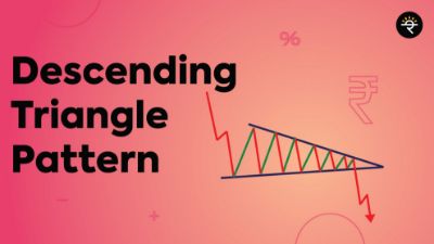
Descending Triangle Pattern


Just like Jay has Veeru, Munna Bhai has Circuit, and Bunny has Avi, even our chart patterns come in duos. Head & shoulder has Inverted head and shoulders, Double top has Double bottom similarly, Ascending Triangle has Descending triangle. We have already discussed the Ascending triangle in our previous blog. If you haven’t read it yet, click here. Now, let’s begin with understanding the Descending triangle pattern.

What is a Descending Triangle Pattern?
The Descending Triangle pattern is a continuation pattern. I am sure you can recall what the continuation pattern means from the previous blog. It just means that the price will ideally continue moving in the same trend as before the consolidation. Since Descending triangle is a bearish formation, it is formed in an ongoing downtrend and the price continues to move downward after consolidating in this pattern. If this pattern is formed at the end of an uptrend, it may signal a bearish reversal.
How is it formed?
This pattern is formed with two lines. The first one is the support level from where the price keeps rebounding. The second line is formed by joining the lower highs in the price movement, making it a descending (Downward sloping) line. This complete formation appears to be like a triangle with a descending line and hence, it’s called a Descending Triangle pattern. Minimum two touchpoints are needed to make the support line and descending line valid.
What does it tell you?
Now, let’s have a look at the price movement in this pattern and understand what it indicates. We already know that the prior trend has been a downtrend for this pattern. After that, the price starts to consolidate. The price reaches the support level multiple times showing buying interest at this level. But whenever the price has bounced back up after testing the support it makes lower highs. These lower highs indicate that the sellers are fighting back to go beyond this support level. This whole scenario creates a bearish build up and eventually, there’s a breakdown at the support level, followed by continuation in the previous downtrend.
AndroidIos
What can be an ideal entry, price target and stop-loss?


For this pattern, one may take a short position (F&O) at the breakdown candle. The price target is calculated by taking the distance of the vertical line of the triangle and then adding it to the breakdown candle. Stop-loss can be placed at the recent high.

Example

Below is the daily chart of ITC which formed a Descending triangle pattern between 20th September 2019 till 1st February 2020. The support level is around 210, being tested 4 times (marked with a tick) The lower highs making the descending trendline was tested twice (marked with a tick) before it gave a strong breakdown with significant above 5-day average volume. Post that the price moved in the previously existing downtrend for a while. The price target was around 170 which was achieved on 4th March 2020 (marked with a tick).

Bottom line

As is the case of Ascending triangle, even Descending triangle may give false breakouts and/or longer consolidation duration. Hence, it is the best practice to get multiple confirmations from other indicators like MACD, RSI, etc. before entering into a position. If technical analysis intrigues you, make sure you click on the link to check out my course where I have explained more such patterns, indicators, and strategies in the most simplified way. Until next time!

Zerodha


Descending Triangle Pattern
Read More